

Kyle Rankin @kyle@librem.one
- Personal Site
- https://kylerank.in
- Personal Bibliography
- https://kylerank.in/writing.html
Admin
Technical author, FOSS advocate, public speaker, Linux security & infrastructure geek, author of The Best of Hack and /: Linux Admin Crash Course, Linux Hardening in Hostile Networks and many other books, ex-Linux Journal columnist.
Joined Apr 2019
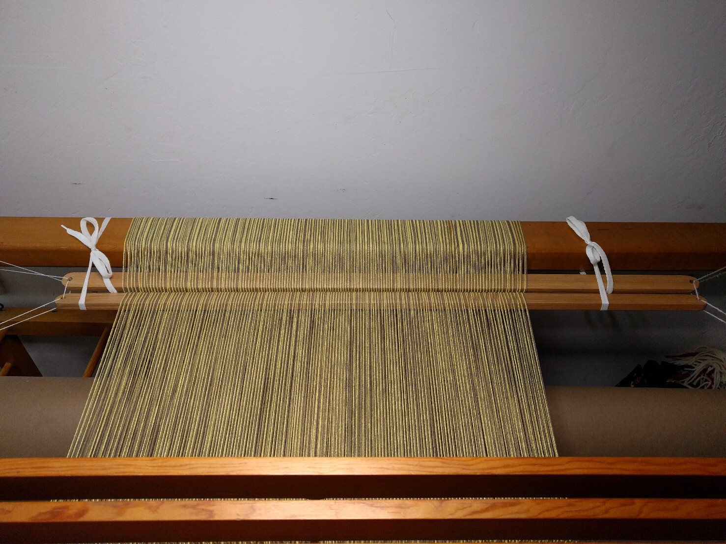
Technical Weaving Thread: Practices to Catch/Prevent Mistakes
Technical Weaving Thread: Practices to Catch/Prevent Mistakes
Technical Weaving Thread: Practices to Catch/Prevent Mistakes
Technical Weaving Thread: Practices to Catch/Prevent Mistakes
Technical Weaving Thread: Practices to Catch/Prevent Mistakes
Technical Weaving Thread: Practices to Catch/Prevent Mistakes
Technical Weaving Thread: Practices to Catch/Prevent Mistakes
Technical Weaving Thread: Practices to Catch/Prevent Mistakes
Technical Weaving Thread: Practices to Catch/Prevent Mistakes
Technical Weaving Thread: Practices to Catch/Prevent Mistakes
Technical Weaving Thread: Practices to Catch/Prevent Mistakes
@jwhevans@mstdn.social Thank you! Yes the case is 210mm x 210mm x 134mm. I ended up disabling the skirt when slicing this model as it would have gone off the print bed!
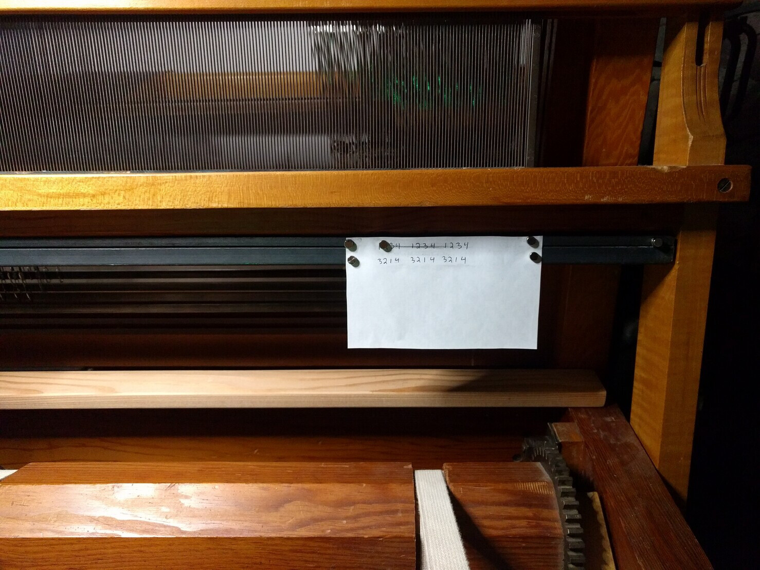
@Kymberly There are all kinds of practices I put in place to try to catch mistakes. Some I picked up from my collection of weaving books and others I just made up. Maybe I will write up a thread listing them later today.
@apples_and_pears Yes the speed of the Comptometers (for trained operators) meant they only needed to make minor refinements over the decades they sold, mostly changes related to catching errors. I have the first Controlled Key Comptometer as well as one of the last models they made and they are very similar apart from a handful of refinements. Great design overall.
@apples_and_pears Ignoring Comptometer, which went their own way, the rest copied the black/green color scheme and full-key layout basically until the post-WWII era when the aesthetic turned toward military greens, shifting to greys in the 50s/60s.
@apples_and_pears For instance, I'm pretty well convinced that the unified UI you saw for full keyboard adder-listers starting in the 1920s had to do with Burroughs dominating the market (and acquiring most big competitors) and the remaining competitors in the market painting their own adder/listers to match the classic Burroughs black case/green felt under the keyboard design from the Model 1 so they could hope to replace Burroughs in some businesses.
@apples_and_pears I have a pretty good cross-section of different designs in my calculator collection, and the common thread seems to be that the UI is simply a method to expose whatever mechanically needed to be done behind the scenes. That combined with the patent issues meant every design had a different UI.
It's similar to certain Linux CLI applications I won't name where it's clear the developer simply exposed internal function calls instead of thinking about UX.
@apples_and_pears This is the RC Allen whitelabel of the Facit pinwheel calculator I was referring to before. Very unusual key layout but surprisingly nice to use.
- Personal Site
- https://kylerank.in
- Personal Bibliography
- https://kylerank.in/writing.html
Admin
Technical author, FOSS advocate, public speaker, Linux security & infrastructure geek, author of The Best of Hack and /: Linux Admin Crash Course, Linux Hardening in Hostile Networks and many other books, ex-Linux Journal columnist.
Joined Apr 2019
