@adam Remember this is happening in phosh, not the app, really it more analogous to shell showing a busy cursor than a splash screen
@zbrown Anything is better than nothing (which is how it is now). Communicating how long something will take can be done by plain text, a progress bar animation, or progressive loading. Even if the splash screen says "Loading" in plain text, that communicates more of what's going on to the user than a static app icon or throbber does.
@adam well plain text, process bar and progressive loading are all out - phosh simply can't know that
I'm not sure "Loading" adds much
@zbrown Yeah, I don't know anything about the back-end side so that's a shame Phosh is so limited. But from the UX perspective... Which is the best user experience of the following:
- Your spouse leaves without saying anything to you?
- Your spouse puts a orange circular icon on the door and then leaves?
- Your spouse says, "I'm going out to get milk" and then leaves?
- Your spouse says, "I'm going out to get milk and I'll be back in 20 minutes.", leaves, and comes back in 20 minutes?
@adam It's not phosh, it's just how app launching works - you can't do this in shell, KDE, Windows either
Web can do a *bit* better, esp on return visits, but it's still a lot of work and you'll always get an initial blank page and spinner
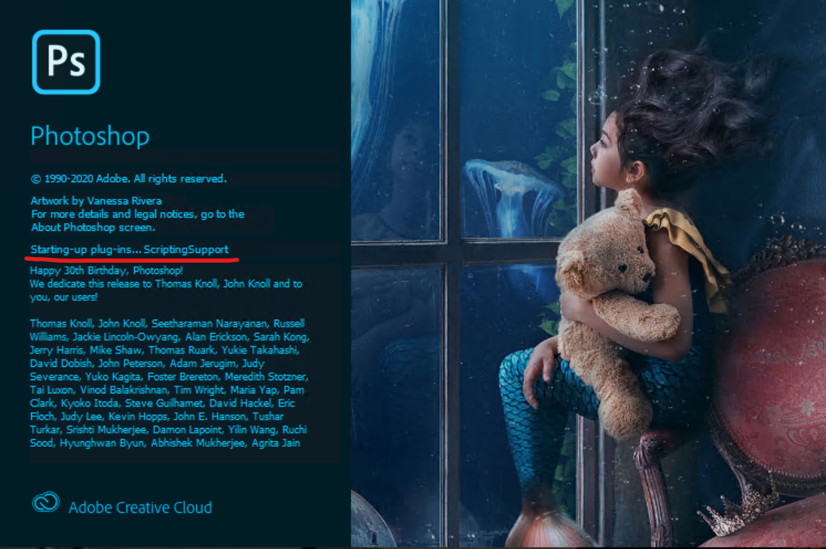
@zbrown I see informative loading screens when launching programs in Windows every day. Photoshop goes through the whole list of "initializing" or "loading" every piece that it needs before the program is available.
@zbrown But, I as a user, know what's going on... and that's the important thing.
@adam Well sure, but that's for an app to do if they want to, phosh simply can't
Nothing about Guido's work prevents apps doing that, they are just showing a placeholder until the app puts something (*anything*) on the screen be it the actual app or a placeholder/splash of their own
@adam @zbrown whenver it comes to proress bars https://xkcd.com/612/ comes to my mind 🙂
@okennedy @agx Yes, that's one step up from "not responding" or frozen. Which is the best user experience of the following:
- Your spouse leaves without saying anything to you?
- Your spouse puts a orange circular icon on the door and then leaves?
- Your spouse says, "I'm going out to get milk" and then leaves?
- Your spouse says, "I'm going out to get milk and I'll be back in 20 minutes.", leaves, and comes back in 20 minutes?
@adam @agx I completely agree that there are more opportunities for improvement here, and if that was your entire argument then I withdraw my objection. Your original post had a very disparaging tone that made it seem like you felt that this was moving things in the wrong direction. (It seems to me like a splash screen would be a prerequisite for a progress bar)
@okennedy @adam exactly! The whole point is to demo that we detect the app launch correctly, come up with some animation and have a rough idea when to close that thing (which is the most complicated bit). Spinners, nicer graphics, etc are yet to come. It's all divide and conquer:separate UI representation from the lower level plumbing so design and plumbing can progress.
@agx @okennedy I don't think you need fancy animations or ambiguous graphics at all. Just be flat out completely honest with the user: "I'm loading Firefox right now." That will make it very obvious and obvious is best: https://medium.com/google-design/the-obvious-ui-is-often-the-best-ui-7a25597d79fd
@okennedy @agx Yes, I totally apologize for the disparaging tone!! The intention of being helpful was my goal as I would like to see Linux on smartphones succeed and I believe the best way to do that is with extremely user-friendly design, since I don't think Linux will be able to afford Apple level marketing.

@adam Good luck telling the user how long arbitrary code will take to show something useful