Follow
@sjb
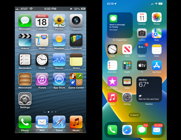
Apple made an awful lot of bad design decisions at that time, but THIS… was just a giant leap to making it visually unbearable to me. They somehow simplified everything by making it flat, but added tons of tiny details at the same time — just look at the notches on Safari compass or cog of the Settings app! It's an eyesore! 😵💫
@neglesaks@mstdn.io
@sjb
Yes, most probably this is what they've had in mind.
Backgrounds of old icons would certainly also benefit from higher resolution, but there was an internal competition between design teams at the time: one was for skeuomorphism, and the one led by Jony Ive was for "flat" design. The latter won so they've just got rid of old design 😢
@neglesaks@mstdn.io

@m0xee @neglesaks Got to show off that Retina display somehow?