

@RL_Dane TBH I didn't like it when these were arc shaped — grapes of wrath as I called them 🤭
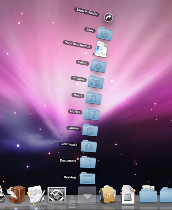
I did like it 10.4-style when you got just a list of what's inside the folder when you long-clicked the folder in the Dock and I did like it more when they've made it just a rectangle, probably in 10.6 or 10.7
@RL_Dane iLife was free I think. And it came with a trial version of iWork. You could upgrade it to full when Mac App Store was introduced as it couldn't tell those apart 🤭
Tiger looked super-cool! Today the stripes look old fashioned, but 10.5 felt wrong without them. TBH I think they didn't look that prominent on real screens as they do now on screenshots, the fact that default screen gamma was changed from 1.8 to 2.2 to match Windows in Mac OS X 10.5 might have contributed to that 🤔

@m0xee
The pinstripes *were* super cool! I didn't know about the gamma change, that kinda stinks. :/